The latest version of this text can be found at https://info340.github.io/.
Chapter 6 CSS Options
Chapter 5 explained the basic syntax and usage of CSS, enough to let you create and style your own web pages. This chapter provides more details about additional selectors and properties to use when defining CSS rules; the following chapter discusses particular properties that can be used to further style the layout of your page’s content.
6.1 Compound Selectors
As described in the previous chapter, the core selectors used in CSS are the element selector, class selector, and id selector. However, CSS does offer ways to combine these selectors in order to specify rules only for particular elements or groups of elements.
Group Selector
The group selector allows you to have a single rule apply to elements matched by lots of different selectors. To do this, separate each selector with a comma (,); the properties defined in the rule will then apply to any element that is matched by any of the selectors. For example, if you want to have a single style for all headings, you might use:
/* applies to h1, h2, AND h3 tags */
h1, h2, h3 {
    font-family: Helvetica;
    color: #4b2e83; /* UW purple */
}
The comma-separated selectors can by any kind of selector, including .class or #id selectors (or any of the combound selectors described below):
/* can also include class or id selectors */
/* this rule applies to h2 elements, "menu" classed elements, and the
   #sidebar element */
h2, .menu, #sidebar {
    background-color: gray;
}
Note that since later rules take precedence earlier ones, you can use a group select to apply a property to multiple different elements, then include additional rules to add variations. For example, you can have one rule that applies “general” styling to a large class of elements, with further rules then customizing particular elements.
/* all headings are Helvetica, bold, and purple */
h1, h2, h3 {
    font-family: Helvetica;
    font-weight: bold;
    color: #4b2e83; /* UW purple */
}

/* h2 elements are not bolded, but italic */
h2 {
    font-weight: normal; /* not bold, overrides previous rule */
    font-style: italic;
}
Combined Selectors
It is also possible to combine element, class, and id selectors together to be more specific about where a rule applies. You do this by simply putting the class or id selector immediately after the previous selector, without a comma or space or anything between them:
/* Selects only p elements that have class="alert"
   Other p elements and "alert" classed elements not affected */
p.alert {
  color: red;
}

/* Selects only h1 elements that have id="title" */
/* Note that this is redundant, since only one element can have the id! */
h1#title {
  color: purple;
}

/* Selects elements that have class "alert" AND class "success" */
.alert.success {
  color: green;
  font-size: larger;
}

/* And can combine with group selector */
/* applies to <p class="highlighted"> and <li class="selected"> */
p.highlighted, li.marked {
  background-color: yellow;
}
This specificity can allow you to reuse class names (e.g., for shared semantics and readability purposes) but have them work differently for different elements. So a “highlighted” paragraph p.highlighted might look different than a “highlighted” heading h1.highlighted.
Note that putting a space between the selectors parts instead specifies a descendant selector, which has a totally separate meaning. Every character matters!
Descendant Selector
So far, all selectors mentioned will apply to matching elements regardless of where they are in the HTML element tree. But sometimes you want to be more specific and style only a set of elements that exist within a particular parent or ancestor element, and not all the other matching elements elsewhere in the page. You can do this form of targeted selecting using a descendant selector. This is written by putting a blank space ( ) between selectors. Elements are only selected if they have parents that match the selectors that precede them:
<header>
   <h1>Welcome to the page</h1>
   <p>I am a special paragraph</p>
</header>
<section>
   <p>some other paragraph</p>
</section>
/*
Selects p elements that exist within header elements
Other p elements will not be affected
*/
header p {
/* ... */
}You can have as many “levels” of a descendant selector as you want, and each level can be made up of any kind of selector. However, it is best to not have more than 2 or 3 levels. If you need to be more specific than that, then perhaps defining a new .class is in order.
/* selects elements with class="logo"
   contained within <p> elements
   contained within <header> elements */
header p .logo {
    /* ... */
}
Note that descendant selectors will select matching descendant elements anywhere lower in the tree branch, not just direct children, so the .logo elements here could be nested several layers below the <p> element (perhaps inside a <span>). This is usually a good idea because you may introduce new nesting layers to your page as you go along, and don’t want to modify the CSS. But if you really want to select only direct children, you can use a variant known as a child selector, which uses a > symbol to indicate direct descendants only:
<body>
  <p>Body content</p>
  <section>
    <p>Section content</p>
  </section>
</body>
/* Selects paragraph "Body content" (immediate child of body),
not paragraph "Section content" (immediate child of section) */
body > p {
color: blue;
}Pseudo-classes
The last kind of selector you will commonly use in web development is the application of what are called pseudo-classes. These select elements based on what state the element is in: for example, whether a link has been visited, or whether the mouse is hovering over some content. You can almost think of these as pre-defined classes built into the browser, that are added and removed as you interact with the page.
Pseudo-classes are written by placing a colon (:) and the name of the pseudo-class immediately after a basic selector like an element selector. You’ll see this most commonly with styling hyperlinks:
/* style for unvisited links */
a:link { /*...*/ }

/* style for visited links */
a:visited { /*...*/ }

/* style for links the user is hovering over with the mouse */
a:hover { /*...*/ }

/* style for links that have keyboard focus */
a:focus { /*...*/ }

/* style for links as they are being 'activated' (clicked) */
a:active { /*...*/ }
Remember to always set both hover and focus, to support accessibility for people who cannot use a mouse. Additionally, a:hover must come after a:link and a:visited, and a:active must come after a:hover for these states to work correctly.
Note that there are many additional pseudo-classes, including ones that consider specific element attributes (e.g., if a checkbox is :checked) or where an element is located within its parent (e.g., if it is the :first or :last-child, which can be useful for styling lists).
nth-* Selectors
Two powerful pseudo-class selectors are the nth-child and nth-of-type selectors. These selectors allow you to select specific elements based on their position in the DOM. For example, you may want the third <li> element in a (each) list to have a certain style. To do that, you can use the either the nth-child or nth-of-type selector (there’a great description of the difference between these here):
/* Get third li element  */
li:nth-of-type(3) {
  color:red;
}
The nth-* selectors also support the keywords odd and even, which is really useful for styling tables:
/* Give every-other row a light-gray background */
tr:nth-of-type(even) {
  background-color:#eee;
}
Attribute Selectors
Finally, it is also possible to select element that have a particular attribute by using an attribute selector. Attribute selectors are written by placing brackets [] after a basic selector; inside the brackets you list the attribute and value you want to select for using attribute=value syntax:
/* select all p elements whose "lang=sp" */
p[lang="sp"] {
    color: red;
    background-color: orange;
}
It is also possible to select attributes that only “partially” match a particular value; see the documentation for details.
Note that it is most common to use this selector when styling form inputs; for example, to make checked boxes appear different than unchecked boxes:
/* select <input type="checkbox"> that have the "checked" state */
input[type=checkbox]:checked {
    color: green;
}
6.2 Property Values
This section of the guide provides further details about the possible values that may be assigned to properties in CSS rules. These specifics are often relevant for multiple different properties.
Units & Sizes
Many CSS properties affect the size of things on the screen, whether this is the height of the text (the font-size) or the width of a box (the width; see the next chapter). In CSS, you can use a variety of different units to specify sizes.
CSS uses the following absolute units, which are the same no matter where they are used on the page (though they are dependent on the OS and display).
| Unit | Meaning |
|---|---|
px |
pixels (\(\frac{1}{96}\) of an inch, even on high-dpi “retina” displays) |
in |
inches (OS and display dependent, but maps to physical pixels in some way) |
cm, mm |
centimeters or millimeters, respectively |
pt |
points (defined as \(\frac{1}{72}\) of an inch) |
Although technically based on in as a standard, it is considered best practice to always use px for values with absolute units.
CSS also uses the following relative units, which will produce sizes based on (relative to) the size of other elements:
| Unit | Meaning |
|---|---|
em |
Relative to the current element’s font-size. Although originally a typographic measurement, this unit will not change based on font-family. |
% |
Relative to the parent element’s font-size or dimension. For font-size, use em instead (e.g., 1.5em is 150% the parent font-size). |
rem |
Relative to the root element’s font-size (i.e., the font-size of the root html or body element). This will often be more consistent than em. |
vw, vh |
Relative to the viewport (e.g., the browser window). Represents 1% of the viewport width and height, respectively. This unit is not supported by older browsers. |
Note that most browsers have a default font size of 16px, so 1em and 1rem will both be initially equivalent to 16px.
In general, you should specify font sizes using relative units (e.g., em)—this will support accessibility, as vision-impaired users will be able to increase the default font-size of the browser and all your text will adjust appropriately. Absolute units are best for things that do not scale across devices (e.g., image sizes, or the maximum width of content). However, using relative sizes will allow those components to scale with the rest of the page.
- Font-sizes should always be relative; layout dimensions may be absolute (but relative units are best).
Colors
Colors of CSS properties can be specified in a few different ways.
You can use one of a list of 140 predefined color names:
p {
   color: mediumpurple;
}
While this does not offer a lot of flexibility, they can act as useful placeholders and starting points for design. The list of CSS color names also has a fascinating history.
Alternatively, you can specify a color as a “red-green-blue” (RGB) value. This is a way of representing additive color, or the color that results when the specified amount of red, green, and blue light are aimed at a white background. RGB values are the most common way of specifying color in computer programs.
p {
   color: rgb(147, 112, 219); /* medium purple */
}
This value option is actually a function that takes a couple of parameters representing the amount of red, green, and blue respectively. Each parameter ranges from 0 (none of that color) to 255 (that color at full). Thus rgb(255,0,0) is pure bright red, rgb(255,0,255) is full red and blue but no green (creating magenta), rgb(0,0,0) is black and rgb(255,255,255) is white.
Note that if you want to make the color somewhat transparent, you can also specify an alpha value using the rgba() function. This function takes a 4th parameter, which is a decimal value from 0 (fully transparent) to 1.0 (fully opaque):
p {
   background-color: rgba(0,0,0,0.5); /* semi-transparent black */
}
CSS also supports hsl() and hsla() functions for specifying color in terms of a hue, saturation, lightness color model.
Finally, and most commonly, you can specify the RGB value as a hexadecimal (base-16) number.
p {
   color: #9370db; /* medium purple */
}
In this format, the color starts with a #, the first two characters represent the red (ranging from 00 to FF, which is hex for 255), the second two characters represent the green, and the third two the blue:
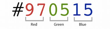
How to reading a hex value, from Smashing Magazine.
This is a more compact and efficient way to describe the RGB of a color, and is how most digital artists convey color. See this article for more details about encoding colors.
Fonts and Icons
As mentioned in the previous chapter, you specify the typographical “font” for text using the font-family property. This property takes a comma-separated list of fonts to use; the browser will render the text using the first font in the list that is available (you can think of the rest as “back-ups”).
p {
    font-family: 'Helvetica Nue', 'Helvetica', 'Arial', sans-serif;
}
The last font in the list should always be a generic family name. These are a list of “categories” that the browser can draw upon even if the computer doesn’t have any common fonts available. In pracice, the most common generic families used are serif (fonts with serifs, e.g., “Times”), sans-serif (fonts without serifs, e.g., “Arial”), and monospace (fonts with equal width characters, e.g., “Courier”).
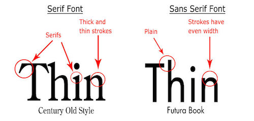
Serif vs. Sans-Serif fonts. From 99designs.ca.
It is also possible to include specific fonts in your web page, which will be delivered to the browser by the web server in case the client doesn’t have the previously available. You do this manually by using the @font-face rule, and specifying the url for the font file (usually in .woff2 format).
However, it is usually easier to instead include a stylesheet that already has this rule in place. For example, the Google Fonts collection provides more than 800 different freely available fonts that you can include directly in your web page:
<head>
    <!-- ... -->

    <!-- load stylesheet with font first so it is available -->
    <link href="https://fonts.googleapis.com/css?family=Encode+Sans" rel="stylesheet">

    <!-- load stylesheet next -->
    <link href="css/style.css" rel="stylesheet">
</head>
body {
font-family: 'Encode Sans', sans-serif; /* can now use Encode Sans */
}
Notice that the <link> reference can be to an external file on a different domain! This is common practice when utilizing fonts and CSS frameworks.
Important Note that when using Google Fonts, you’ll need to specify if you also want variations such as bold or italic typesets. For example, the Encode Sans font is available in font weights (what you would set with font-weight) from 100 to 900, but you need to specify these in the linked resource:
<!-- includes normal (400) and bold (700) weights -->
<link href="https://fonts.googleapis.com/css?family=Encode+Sans:400,700" rel="stylesheet">
If you don’t include the different set of glyphs for the bolded font, then setting the text in that font to bold won’t have any effect (because the browser doesn’t now how to show text in “Bold Encode Sans”)!
You can also use external font styles to easily add icons (symbols) to your web page by using an dingbat (icon) font. These are similar in concept to the infamous Wingdings font: they are fonts where instead of the letter “A” looking like two bent lines with a bar between, it instead looks like a heart or a face or some other symbol. By including such a font, you get access to a large number of symbols that can easily be styled (read: colored and sized) to suit your needs.
Emoji are defined using a different set of Unicode values, and are browser and operating-system instead of being available through a font.
The most popular icon set is called Font Awesome. You can include the Font Awesome font by linking to it as any other stylesheet:
<link href="https://maxcdn.bootstrapcdn.com/font-awesome/4.7.0/css/font-awesome.min.css" rel="stylesheet">This will load the stylesheet from a Content Delivery Network (CDN), which is a web service intended to quickly serve files commonly used by multiple websites. In particular, browsers will cache (save) copies of these files locally, so that when you visit a different website (or the same website for a second time), the file will already be downloaded. We will load most of the CSS and JavaScript frameworks used in this class from a CDN.
The
.minbefore the.cssextension in the filename is a convention to indicate that the file is minimized: all extraneous spaces, comments, etc. have been removed to make the file as small and quick to download as possible.
Font Awesome icons can then be included in your HTML by including an element with an appropriate CSS class (that sets the style of that content to be the correct font with the correct “character” content). For example, you can include a Universal Access icon with
<i class="fa fa-universal-access" aria-hidden="true"></i>- Because the icon has no semantic meaning beyond an appearance, it is often included with a semantically-deficient (empty)
<i>element. Remember to include anaria-hiddenattribute so that a screen-reader won’t try to read the strange letter!
Other icon-based fonts include Gylphicons and Octicons.
Backgrounds and Images
You have previously seen how to use the the background-color property to color the background of a particular element. However, CSS supports a much wider list of background-related properties. For example, the background-image property will allow you to set an image as the background of an element:
header {
    background-image: url('../img/page-banner.png');
}
This property takes as a value a url() data type, which is written like a function whose parameter is a string with the URI of the resource to load. These URIs can be absolute (e.g., http://...), or relative to the location of the stylesheet (not to the web page!—you may need to use .. if your .css file is inside a css/ directory.
There are additional properties used to customize background images, including where it should positioned in the element (e.g., centered), how large the image should be, whether it should repeat, whether it should scroll with the page, etc.
header {
    background-image: url('../img/page-banner.png');
    background-position: center top; /* align to center top */
    background-size: cover; /* stretch so element is filled; preserves ratio (img may be cropped) */
    background-repeat: no-repeat; /* don't repeat */
    background-attachment: fixed; /* stay still when window scrolls */
    background-color: beige; /* can still have this for anything the image doesn't cover
                                (or for transparent images) */
}
This is a lot of properties! To understand all the options for their values, read through the documentation and examples (also here and here).
To try and make things easer, CSS also includes a shorthand property called just background. Shorthand properties allow you to specify multiple properties at once, in order to keep your code more compact (if somewhat less readable). Shorthand properties values are written as a space-separated list of values; for example, the above is equivalent to:
header {
    background: url('../img/page-banner.png') top center / cover no-repeat fixed beige;
}- The
background-positionandbackground-sizeare separated by a/since they both can have more than one value. - You can include some or all of the available background properties in the shorthand. Unlike most shorthand properties, the
backgroundproperties can go in any order (though the above is recommended).
Note that a shorthand property is interpreted as writing out all of the rules it replaces; so will replace any previous properties within the same rule:
body {
    background-color: gold;
    background: mediumpurple; /* later property override previous ones */
                              /* page will have a purple background */
}
Additionally, all of the background properties support multiple backgrounds by using a comma-separated list of values. This can enable you to easily overlay partially-transparent images on top of each other, similar to using layers in Photoshop.
There are many, many other properties you can use as well to style your page. Be sure and look through all the documentation and examples, and explore the source code of existing pages to see how they achieved particular effects!
Resources
- CSS Diner a fun game for practicing with different CSS selectors
- CSS Units and Values (MDN)
- The Code Side of Color
- CSS Backgrounds (MDN)